 The way we use the internet is changing rapidly and web designers have responded to this with Flat Design - clean, simple graphics that don't use gradients or shading to create a three dimensional effect, instead allowing the focus to be the textual content - and Responsive Websites - sites which work well on any platform, with fluid grids that adapt to whatever technology is being used, whether it's a smart phone, tablet or desktop.
But perhaps the most radical trend in web design is currently 'Pageless', a design concept that dismisses old-fashioned notions of structure and layout. Pageless websites make perfect sense- unlike books, websites are not contained between covers, nor are they limited to ink and paper, flat and unmoving and silent. So why then, are websites built around a book-based design model, with pages and lists of content?
Pageless websites are not restricted by print-based design. They consist of one page which users can scroll up and down to find what they want. There can be a navigation bar with links to relevant sections of the page should a user wish to read a particular section, but the idea is that users will read through the entire website, rather than flick between sections as they would normally flick through a website's pages.
It sounds like an interesting concept, but what is the point of pageless design? Here are just five reasons why pageless websites are more than a passing fad and why they could become the future of the web design:
1. It's purposeful
Standard websites are often structured like catalogues of information, with no clear purpose. The information on pageless sites has to be condensed, so it is clearer and more concise. Traditionally, users have to navigate themselves around a website, looking for links and searching through numerous pages to find what they want. With pageless design, the user is led on a journey through one page which is more likely to end with the achievement of a specific goal (for example, the user buys a product or the user shares the site with friends) because their journey through the site has been mapped out by the web designer.
2. It's engaging
Users are more likely to spend longer on pageless sites because they are quick to consume and easy to use- the only option is to scroll up and down, or click on specific links. There's no opportunities for users to become frustrated when links don't work or they can't find what page they are looking for. Pageless design is less like a paper catalogue or book and more like an interactive journey, a model that can not be emulated in any other media because it is unique to the internet.
3. It's responsive
Designers can make great use of Java script and CSS to make pageless sites responsive. As there is just one page to take care of, it's easier to make sure the site translates into different technologies like Kindle, iPad, Android etc.
Pageless design isn't without its disadvantages. The concept works best for companies with one product to sell or a story to tell, it wouldn't benefit large companies with hundreds of products to sell. (Although some large companies can still make use of some of the features of pageless design on their landing page. Take a look at the Nike and Rimmel London websites to see examples of this.) There's also the question of upload speed- pageless sites contain a lot of information. This really depends on broadband speed and server capabilities. (You could also argue that for this same reason, maintenance is easy with pageless websites and the site would be less likely to crash.)
Currently, pageless sites look impressive - contemporary, innovative and fresh. But if these types of sites really are the future of web design, it means you must take advantage of their uniqueness now, before pageless sites become the norm.
Want to get started? Check out our friends at WrapBootstrap who provide some awesome one page themes that you can modify and use yourself with one of our great low cost hosting plans!
Stuck for ideas? Here are some examples of pageless sites for inspiration!
Inspire Conference

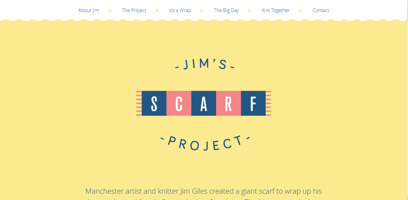
Jim's Scarf
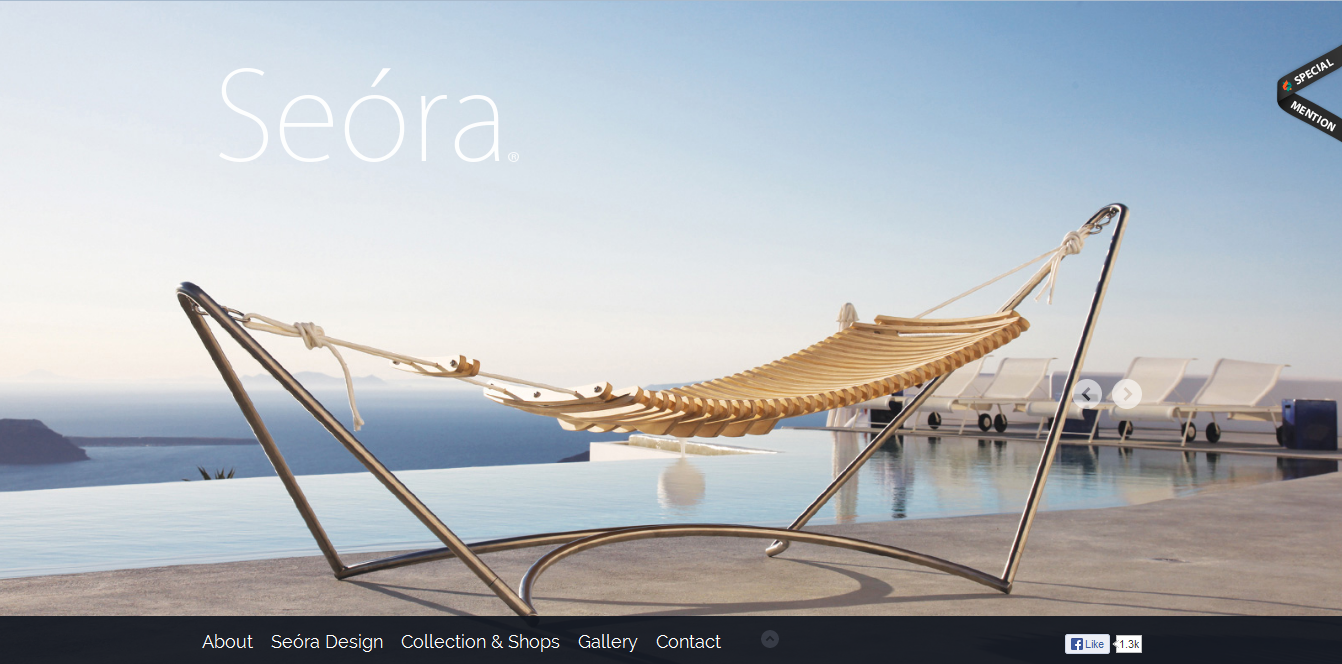
Seora Design
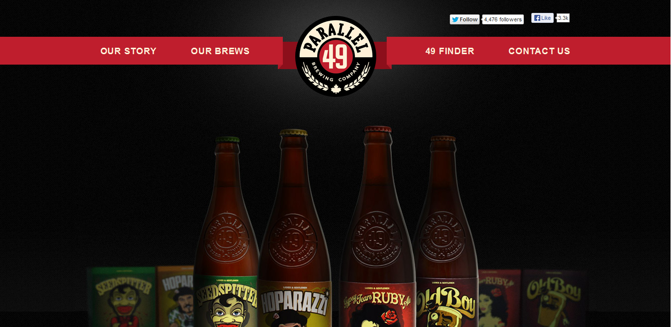
Parallel 49 Brewery
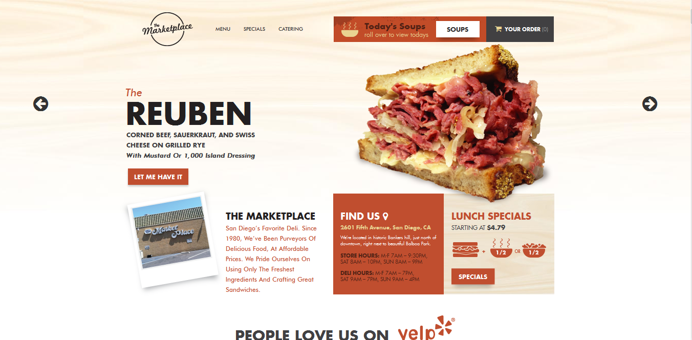
The Marketplace Deli
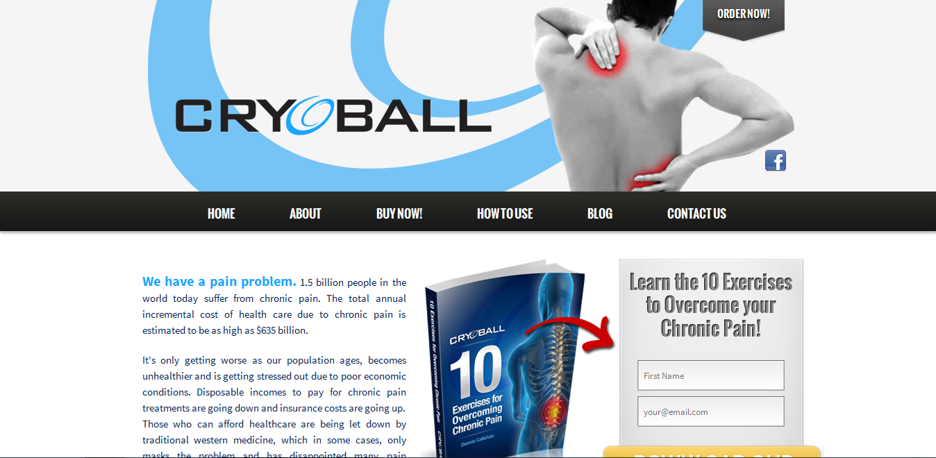
Cryoball
